" height="195.49px" id="INxFYoxef" width="183.36073967467004px"/><path d="M 0 0.02 C 30.13 6.23 60.26 12.45 90.39 18.66 C 111.16 14.44 131.94 10.23 152.71 6.01 C 153.23 20.53 153.74 35.04 154.26 49.56 C 150.79 46.74 145.46 43.36 139.74 44.33 C 132.08 45.63 130.99 53.5 122.71 55.19 C 115.54 56.65 113.37 51.37 104.9 52.26 C 96.46 53.15 96.16 58.67 88.84 60.39 C 75.81 63.45 70.36 47.47 52.65 47.04 C 40.94 46.75 38.66 53.63 29.04 50.72 C 21.64 48.48 18.51 43.07 10.27 42.78 C 5.86 42.63 2.24 44.02 0.01 45.1 L 0.01 0 Z" fill="rgb(206, 236, 252)" height="60.77910000525753px" id="a36OALM1a" transform="translate(14.189 67.34)" width="154.26px"/><path d="M 152.139 149.195 C 137.569 158.735 107.749 175.695 93.559 175.495 C 77.709 175.285 62.709 171.885 47.559 168.355 C 31.949 164.715 17.469 159.075 3.229 152.055 C 0.379 150.645 0.519 141.255 0.639 134.585 L 1.189 104.185 C 1.419 91.305 0.969 79.015 0.089 66.225 C -0.261 61.185 0.379 54.935 2.719 52.845 L 36.439 22.665 C 36.709 22.425 36.879 22.095 36.899 21.725 C 37.479 12.385 35.639 -0.285 40.859 0.005 C 69.429 1.575 97.119 5.905 124.539 12.785 C 129.539 14.035 127.559 22.725 127.839 30.635 C 127.859 31.065 128.069 31.455 128.419 31.705 L 142.609 41.795 C 149.229 46.505 154.969 51.845 159.809 58.445 C 160.409 59.265 160.749 60.255 160.799 61.275 L 162.929 100.195 C 163.689 114.145 163.489 127.525 161.959 141.225 C 161.838 142.284 161.252 143.233 160.359 143.815 L 152.129 149.205 Z M 8.849 56.925 L 8.669 57.105 C 6.739 59.495 6.639 65.745 7.099 71.195 C 7.989 81.605 8.379 92.045 8.329 102.495 C 8.289 112.725 7.489 122.915 7.619 133.135 C 7.669 137.215 7.809 141.295 8.059 145.365 C 8.089 145.835 8.359 146.265 8.769 146.495 C 28.189 157.185 56.199 164.705 78.579 167.075 L 93.239 168.625 C 93.339 168.635 93.439 168.635 93.529 168.625 C 100.069 168.035 106.229 165.475 112.299 162.975 C 122.459 158.785 131.089 152.665 140.609 147.615 L 151.639 141.765 L 151.789 141.675 L 153.339 140.575 C 154.849 139.508 155.748 137.774 155.749 135.925 C 155.719 111.495 155.329 86.975 153.719 62.485 C 153.669 61.795 153.389 61.135 152.919 60.635 C 143.869 51.055 133.589 43.315 122.509 35.935 C 119.439 33.895 121.319 26.485 120.669 20.015 C 120.609 19.445 120.179 18.975 119.619 18.835 C 95.039 12.815 71.059 9.125 45.839 7.285 C 45.099 7.235 44.459 7.775 44.359 8.515 C 43.639 14.205 45.089 20.105 42.939 26.055 C 42.859 26.275 42.729 26.465 42.549 26.625 L 8.819 56.925 Z" fill="rgb(12, 14, 14)" height="175.49664310354038px" id="xlP6hhhbx" transform="translate(10 9.995)" width="163.35980016335907px"/><path d="M 101.45 9.701 C 102.6 12.581 96.6 11.801 88.66 10.301 L 74.14 7.571 L 52.15 4.021 L 42.2 3.061 C 41.07 2.951 40.56 2.741 40.19 2.431 C 34.24 -2.519 54.77 1.341 66.08 3.081 L 74.9 4.441 L 88.96 7.131 C 94.16 8.131 100.62 7.651 101.44 9.691 Z M 98.71 34.801 C 93.56 41.311 87.08 52.121 84.76 50.651 C 84.44 50.451 83.61 49.611 84.11 48.961 L 89.65 41.711 C 95.36 34.241 107.33 16.311 108.04 21.501 C 108.14 22.231 108.16 22.861 107.51 23.681 L 98.7 34.811 Z M 75.25 53.681 C 75.45 54.211 74.98 55.341 74.07 55.211 L 66.85 54.181 L 46.15 49.701 C 31.63 46.551 17.31 45.031 3.42 40.251 L 3.37 38.101 C 3.78 38.001 4.55 37.481 5.35 37.701 L 12.65 39.691 C 24.26 42.851 35.96 44.131 47.72 46.681 L 69.06 51.311 L 73.05 51.861 C 73.94 51.981 74.49 52.091 74.97 52.491 C 75.3 52.771 75.49 53.261 75.24 53.671 Z M 77.86 96.261 C 77.79 110.271 75.77 138.421 65.59 137.281 C 60.7 136.731 58.22 128.411 56.85 121.241 C 54.63 109.691 55.17 98.221 57.06 86.561 C 57.23 85.501 57.37 83.921 57.71 83.101 C 59.59 78.591 60.04 72.641 65.02 67.941 C 67.88 65.251 71.96 65.791 74.01 68.941 C 76.92 73.401 77.92 84.001 77.89 90.961 L 77.86 96.251 Z M 61.88 91.801 C 60.05 104.031 60.15 119.861 65.97 131.681 C 67.88 130.291 68.23 128.611 68.82 126.771 C 72.27 116.171 72.41 100.161 72.15 88.251 C 72.01 81.621 71.06 72.801 69.52 72.021 C 66.72 70.611 63.2 82.991 61.88 91.801 Z M 6.29 71.971 C 6.35 73.111 6.36 74.341 6.27 76.001 L 5.91 83.031 L 11.49 84.821 C 12.58 85.171 13.15 85.441 13.85 84.621 C 14.5 83.861 14.51 82.681 14.3 81.721 C 14.01 80.361 14.16 78.851 14.2 76.971 L 14.35 69.981 L 14.35 61.981 C 14.35 61.331 14.3 60.671 14.45 60.041 C 14.68 59.101 15.49 58.591 16.13 58.451 C 17.25 58.221 18.23 58.401 18.93 59.411 C 19.69 60.501 19.57 61.841 19.56 63.101 C 19.53 68.041 19.88 72.881 19.72 77.831 C 19.64 80.191 19.57 82.551 19.49 84.911 L 19.49 86.061 L 18.75 125.151 C 18.33 126.241 16.67 126.791 15.98 126.711 C 15.29 126.631 13.63 125.881 13.64 124.721 L 13.75 92.961 C 11.77 90.391 8.28 88.771 5.75 89.091 L 5.09 119.601 C 5.06 120.931 2.72 121.531 1.95 121.211 C 1.37 120.971 -0.01 120.431 0 119.271 L 0.3 90.001 L 0.53 79.991 L 0.66 67.011 L 1.32 54.891 C 1.38 53.281 1.85 52.891 3.33 53.411 C 8.63 52.871 5.72 60.801 6.28 71.981 Z" fill="rgb(12, 14, 14)" height="137.31430717412584px" id="tCigFd5Tj" transform="translate(21.519 30.199)" width="108.09252943164391px"/><path d="M 32.882 22.31 C 32.672 27.82 30.892 34.29 25.442 35.81 L 30.422 63 C 31.642 69.69 35.002 72.85 32.492 75.11 C 28.272 78.9 25.312 66.78 23.592 56.66 C 23.462 54.83 21.462 55.35 22.132 57.02 L 22.322 70.34 C 22.352 72.19 20.032 73.13 18.732 72.48 C 17.732 71.98 16.992 70.94 16.922 69.28 C 16.572 60.47 16.742 52.08 17.222 43.28 L 18.422 21.6 L 18.332 18.28 C 18.252 13.67 17.952 8.66 19.502 5.45 C 23.022 2.93 25.782 1.35 29.122 4.41 C 33.112 8.06 33.132 15.84 32.882 22.29 Z M 26.492 10.13 C 26.182 9 25.772 8.22 24.012 8.57 L 23.362 30.2 C 27.762 30.6 28.672 18.04 26.502 10.14 Z M 16.672 3.49 C 17.072 4.88 16.812 6.01 15.732 7.1 C 12.202 8.55 9.492 4.84 8.042 5.68 C 6.002 6.86 5.722 17.8 6.152 25.28 C 6.172 25.7 5.872 26.33 6.122 26.81 C 6.532 27.59 7.052 27.5 7.812 27.84 L 13.902 30.64 C 15.302 31.28 15.542 32.77 15.312 33.81 C 15.082 34.85 13.702 36.29 12.252 35.66 L 6.182 33.03 C 6.642 42.83 4.352 54.24 6.072 61.31 C 7.292 66.31 16.582 65.29 14.402 69.76 C 13.722 71.14 12.112 71.93 10.302 71.11 L 5.532 68.97 C -3.058 65.11 0.992 46.86 0.722 30.3 C 0.662 26.5 0.572 22.69 0.632 18.88 C 0.702 13.86 0.472 8.27 2.932 3.63 C 4.062 1.5 5.692 0 8.222 0 C 11.612 0.15 14.442 1.85 16.672 3.5 Z" fill="rgb(12, 14, 14)" height="75.82091760919258px" id="vQKPeBjbP" transform="translate(43.547 90.89)" width="33.399874692480736px"/><path d="M 0 0.044 L 3.98 0 L 4.921 84.235 L 0.941 84.279 Z" fill="rgb(12, 14, 14)" height="84.27920078991062px" id="I_pXyPqcQ" transform="translate(102.189 90.083)" width="4.920701971758859px"/></g></svg>)
Koh Kret Identity

Problem
Koh Kret is a culturally layered, car-free island defined by its slow pace and historic Mon pottery, Thai agriculture, and Islamic batik traditions. The challenge was to design a unified visual identity that communicates its unique, slower rhythm and inclusive cultural heritage to Bangkok families seeking a local retreat.
Solution
A flexible, dynamic identity system built around the concept of "Community for Everyone". The brand anchors on a consistent wordmark while utilizing a dynamic, interchangeable "O" symbol, allowing the logo to subtly shift and highlight each of the island’s three distinct cultural groups.
My involvement
Conducted on-the-ground spatial and cultural research, developed the strategic brand positioning, designed the dynamic logo system, engineered custom typography, and translated physical craft patterns into a scalable digital graphic system.
Deliverables
Type
Personal Project
" transform="translate(0 97.415)" width="183px"/></svg>)
Research & Rationale
Process
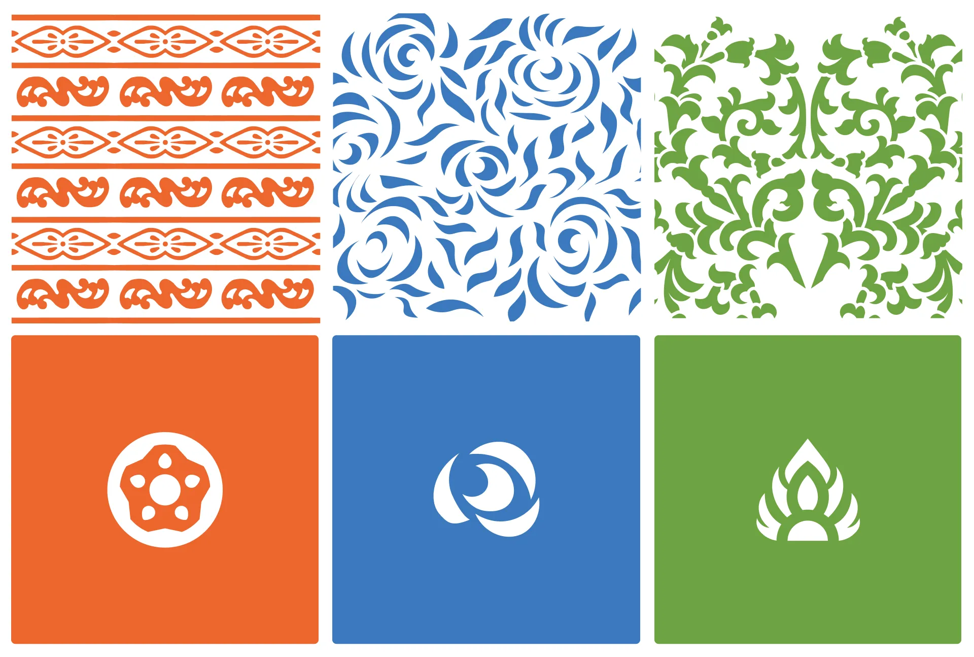
Rather than forcing three cultures into one generic logo, the wordmark functions as a container. Swapping the "O" symbol shifts the visual focus dynamically across Mon pottery (orange), Islamic batik (blue), and Thai agriculture (green) while maintaining brand cohesion.

Designs & Deliverables
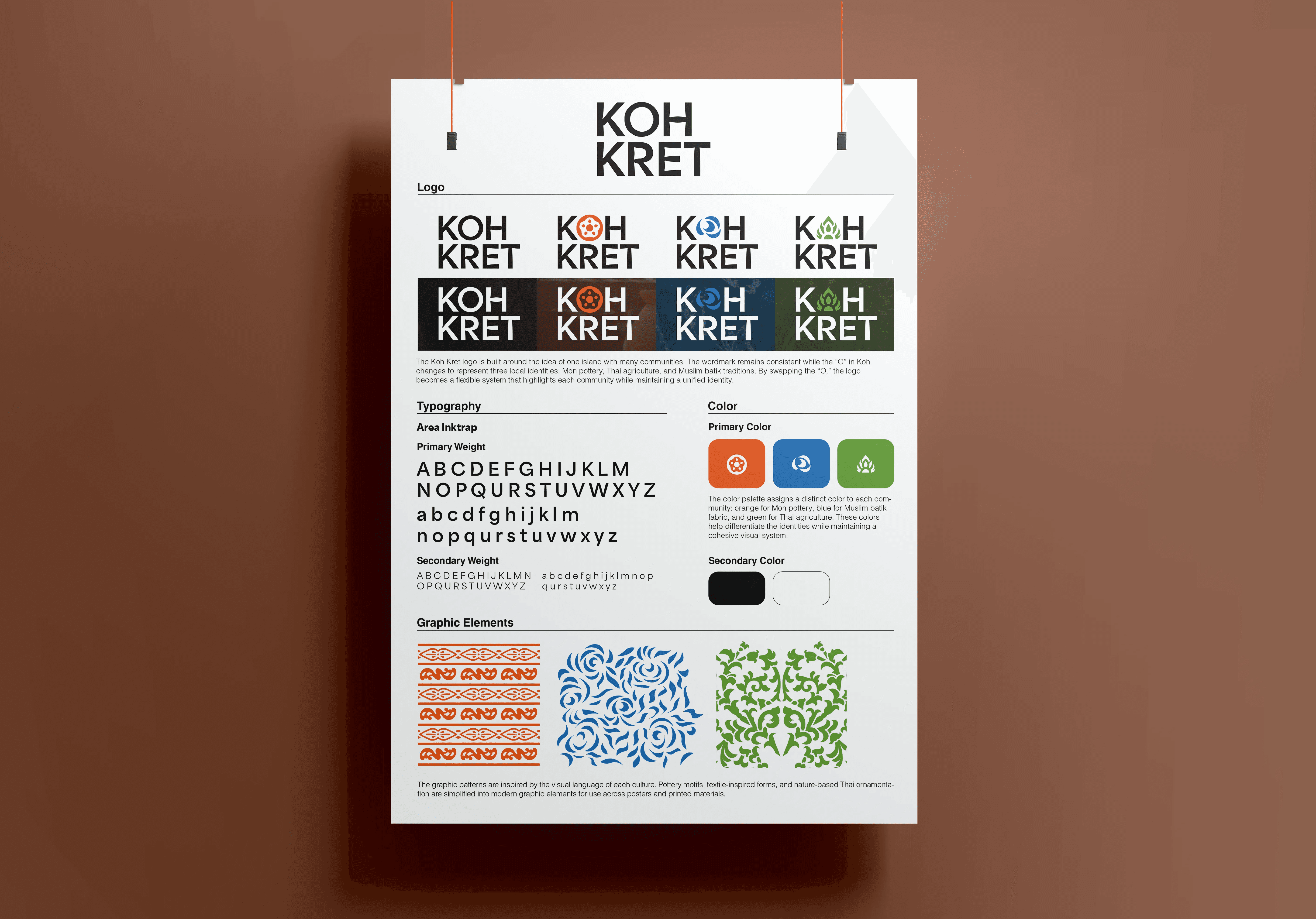
Traditional craft motifs were simplified into modern vector patterns. English type features subtle ink traps referencing Thai script, while expansive negative space across posters mirrors the island's uncrowded pace.
